Thomas MacMillan Photo
Two days before unveiling a budget proposal, Mayor Toni Harp Wednesday gave New Haveners the tools to explore why their tax bills may go up.
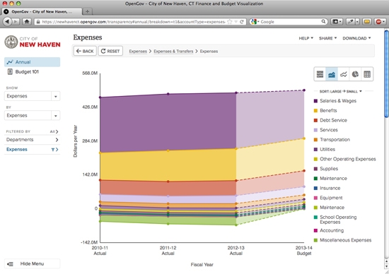
In addition to learning how much their taxes may rise, New Haveners can now click on a colorful line graph and …

… compare, for instance, how much the city spends on salaries versus benefits and debt service.
You can do that using a new website that Mayor Harp (pictured at the top of the story) unveiled on Wednesday. The site—here—offers an interactive look at the city budget, allowing anybody with internet access to quickly see where city money is coming from and how it’s being spent.
The site currently includes budget data from the last four years, including actual numbers for previous fiscal years and budgeted numbers from the current one. City officials said they’ll be uploading the proposed budget for the coming fiscal year soon after it’s submitted this weekend.
Harp said the new website is a way to make the city budget, which totals nearly $500 million in the current fiscal year, more transparent and understandable.
Harp’s proposed budget for the fiscal year that begins July 1 is due on Saturday. She said she plans to submit it Friday. Her spending plan is expected to include a proposed increase to property taxes, news which has drawn howls of protest from taxpayers.
With the new website, Harp aims to calm some of those howls. Harp said the site could foster a “productive discussion” about a tax increase, by allowing people to “see what’s driving the costs in the budget.”
“I want to make it clear: The city’s budget has always been accessible to the public, but always as a lengthy series of line items listed for each department,” Harp said, during a Wednesday press conference in City Hall. “So many pages with such small type sometimes made the budget hard to read and understand. This initiative changes that, to make it interactive, user-friendly, and most of all, more readily accessible.”

Harp credited traffic tsar and former Alder Doug Hausladen (pictured) with coming up with the idea of making the budget interactive online.
“Anyone who takes a very hard look at the budget gets confused very quickly,” Hausladen said. “This should make the budget very simple and easier to understand.”
Via speakerphone and remote computer desktop, Harp and other officials gave a demonstration of how the new site works. The site was designed by Silicon Valley’s OpenGov.com, which has a $2,000 annual contract with the city. OpenGov’s Chris Heggem, patched in from Mountain View, Calif., walked through the site’s basic operation.

You start by calling up newhavenct.opengov.com on your browser. You’ll find a rainbow chart (pictured) of city expenses over the last four years, broken down by department, listed on the right side of the page. Hover over the chart to get actual dollar amounts.

To drill down into the data, simply start clicking. To learn more about the biggest part of the city budget, education, click on the blue “Education” band at the top of the graph. That brings to another rainbow chart (pictured), showing the 132 categories that the Board of Ed spends money on, from operating expenses to school security. You can click on those categories to take a closer look at how spending has changed over the last several years.
You can filter the data in other ways with the tools on the left side of the central chart. If you want to compare, for instance, the amount the city spends on human resources versus the health department, you can select just those two departments.

Also on the left, you can view city spending not just by department, but by kind of spending. So, for instance, you can see how much spending on employee benefits has increased relative to salaries and wages. That data is also available by department.

All of these sorting and filtering options are available for the revenue side of the budget as well, via another option on the left side of the main chart. From the bird’s eye view of city revenue, for instance, you can click down to compare how much the city takes in as real estate taxes versus personal property tax.

And you can view it by department, to see how much, for instance, the building department collects in permits and fees.

Finally, if the rainbow charts make you cross-eyed, you can see the data in other forms, like pie charts and line graphs.

The data is also available as raw numbers, by scrolling down. Those numbers can be shared by email or on social media, or you can download them and play around with them on Excel.
All this data, laid out in this way, will help the average New Havener to understand the budget, Harp said. “They’ll get a really strong understanding of what the budget drivers are.”